Brand Style Guide

Brand Style Guide — Formulation Factory
Colours
Brand Accent
Gold #c9a84c Primary accent — eyebrows, pill borders, dividers, icons
Gold Light #e8c96a Hover states, gradient midpoint
Gold Gradient #c9a84c → #e8c96a → #c9a84c H2 text gradient, top bar accent
Dark Backgrounds
Dark #1a1a1a Primary dark background, body text
Dark 2 #242424 Card backgrounds on dark
Dark 3 #2e2e2e Borders and dividers on dark
Light / Tan Backgrounds
Tan #f3efe6 Page background (light mode)
Tan 2 #f8f6f2 Card surface (light mode)
Border Light #e8e3da Borders and dividers on light
Text
Primary Text #1a1a1a Headlines and body on light
Muted Text rgba(26,26,26,0.5) Body copy on light backgrounds
Muted White rgba(255,255,255,0.6) Body copy on dark backgrounds
Faint White rgba(255,255,255,0.3) Secondary labels on dark
Borders (alpha)
rgba(201,168,76,0.12)
Subtle gold divider
rgba(201,168,76,0.35)
Pill badges, frames
rgba(255,255,255,0.07)
Dark mode hairline
Typography — DM Sans
H1 52–72px
Weight 800
tracking -0.03em
Perform.
H2 28–36px
Weight 700
tracking -0.015em
Built Different
H2 Gradient 28–36px
Weight 700
Gold gradient fill
Built Different
H3 20–24px
Weight 700
What's Inside
Eyebrow 9–10px
Weight 700
tracking 0.22em
Uppercase
10-in-1 Performance Formula
Body 14–15px
Weight 400
line-height 1.7
Every ingredient was chosen with purpose. No filler, no underdosed afterthoughts — just the doses the research supports.
Small / Meta 10–12px
Weight 500–600
tracking 0.1em
Dietary Supplement  ·  120 Capsules  ·  2-Month Supply
Mono DM Mono
11–13px
Weight 400
rgba(201,168,76,0.35)  ·  #c9a84c  ·  0.22em
H2 Gradient Effect
Dark background — primary usage
10 Ingredients. One Formula.

Used on key H2s over dark backgrounds. Never on light.

background: linear-gradient(90deg, #c9a84c 0%, #e8c96a 50%, #c9a84c 100%);
-webkit-background-clip: text;
-webkit-text-fill-color: transparent;
background-clip: text;
UI Components

Buttons

Pill Badges

10-in-1 Masculinity Maximizer Third-Party Tested 2-Month Supply

Stat Cards

250K+ Customers
4.7★ Avg. Rating
10-in-1 Per Formula
Every Batch 3rd-Party Tested
Effects & Motion

Card Drop Shadows — hover to activate

Used on product cards, stat blocks, and feature cards. Three variants — gold glow (primary), white glow (secondary), and neutral depth.

Gold glow — primary
Self Obsessed
Hover to see gold drop shadow
White glow — secondary
Boss Mode
Hover to see white drop shadow
Neutral depth
Heart of Steel
Hover to see depth shadow
/* Gold glow */
box-shadow: 0 8px 32px rgba(201,168,76,0.25), 0 2px 8px rgba(201,168,76,0.1);

/* White glow */
box-shadow: 0 8px 32px rgba(255,255,255,0.1), 0 2px 8px rgba(255,255,255,0.05);

/* Neutral depth */
box-shadow: 0 8px 24px rgba(0,0,0,0.35);

Button Shimmer

Light sweep animation runs on a loop, accelerates on hover. Used on primary CTA buttons.

@keyframes shimmer-slide {
  0% { transform: translateX(-100%) skewX(-15deg); }
  100% { transform: translateX(250%) skewX(-15deg); }
}

.btn::after {
  content: ''; position: absolute;
  width: 30%; height: 120%;
  background: linear-gradient(90deg, transparent, rgba(255,255,255,0.45), transparent);
  animation: shimmer-slide 2.4s ease-in-out infinite;
}

Gradient Divider — UGC / Section Breaks

Horizontal rule with a gold gradient cast. Used between UGC rows on the homepage. Works on both light and dark backgrounds.

Light background
Dark background
height: 1px;
background: linear-gradient(90deg,
  transparent 0%,
  rgba(201,168,76,0.15) 15%,
  rgba(201,168,76,0.6) 35%,
  rgba(232,201,106,1) 50%,
  rgba(201,168,76,0.6) 65%,
  rgba(201,168,76,0.15) 85%,
  transparent 100%);
Dark Card Pattern

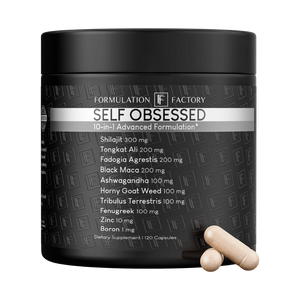
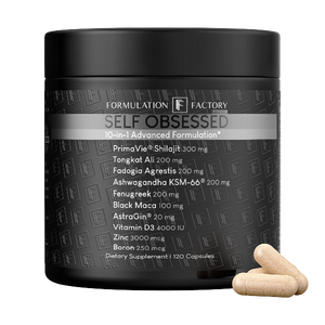
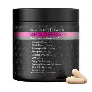
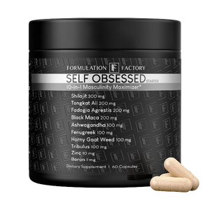
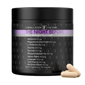
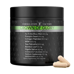
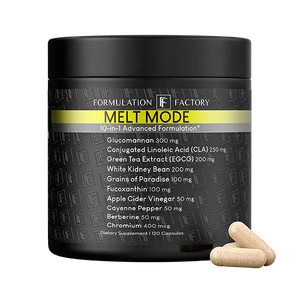
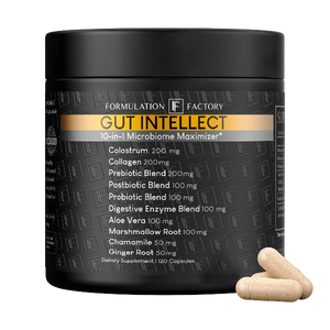
The standard dark card used across email footers, product sections, and hero modules. Gold 2px top bar is the signature detail.

10-in-1 Performance Formula
Built to perform. Nothing held back.

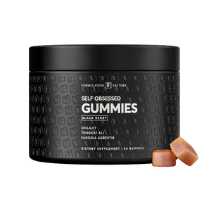
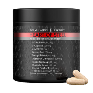
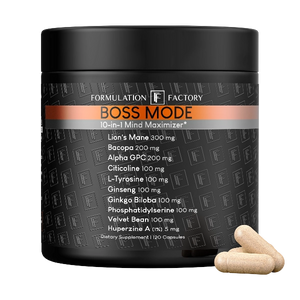
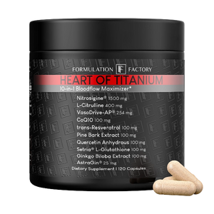
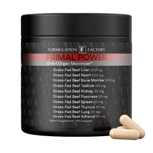
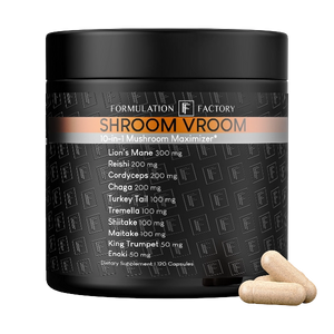
10 synergistic ingredients per formula — each chosen because they do more together than they would separately. Third-party tested on every batch.